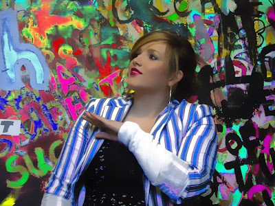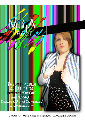
This advert looks very similar to our dvd cover, we did this because we wanted to recognise our dvd as soon as they saw it on the shelf . I also think this is a very stiriking image, so would stand out on the page of a magazine. We included the date the album is out, which well known songs will be on it and also the website they can visit to get more information.
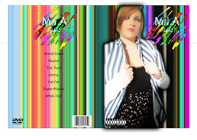
Our dvd album cover!
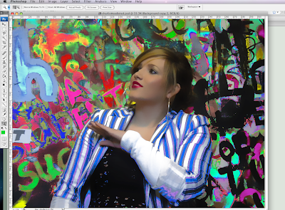
This is our final dvd album cover. On it we have included all the conventions of a dvd album cover, such as the song list, the 'dvd' logo and we made sure to include the parental advisory logo as one of our songs in particular includes swear words. We decided to use an image of Charlotte on the front cover, as she was featured as our main singer in the video, so she would be most recognisable to the audience and so just by looking at the front cover they would be able to tell that this DVD is by M.I.A. We produced this dvd using photoshop. We had an origional picture of charlotte on a plain white background which we airbrushed, cropped and then inserted onto this bright background. Continuing the theme of bright colours, we made a logo for our band. The writing we used has a patchy effect of white writing with bright colours in the background, this makes it look slightly like a graffiti sketch, therefore making it appealing to our audience of teenagers and also relating directly to our feature video, URAQT, in which the preformance was done infront of a graffiti wall. We also made sure to include the practical element of a barcode.
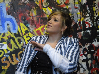
As we wanted our dvd to include something other than just a dvd, we created an exclusive postcard that can come free inside the dvd cover. This can be put on walls or kept as a souveneer of the dvd by the person who purchased it. This is our exclusive postcard:
This would be a recognisable image to someone who had seen our video as it is taken where the video was filmed. To make this postcard we edited our origional photo using the colour replacement tool, we used this to make the real colours of the photo more vibrant and aesthetically pleasing for the audience.
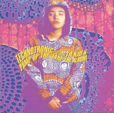
Examples of existing covers:
As one of the aims of this whole project for us has been to create a product which looks retro, as retro or vintage products are currently fashionable. This is an album cover for Technotronic, Pump Up The Jam. It was produced in the 80's so therefore a good product to compare our own too. Similar to ours, the singer is the main focus. She is also surrounded by bright colours.
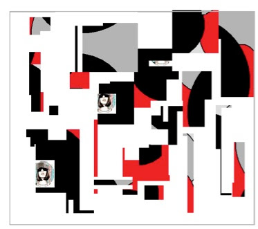
Sam Sparrow, while being a current artist, is known for being very 'retro' and also producing retro looking album covers. Interestingly, this album cover looks very similar to our 'M.I.A' logo. Both our logo and this product have an image with splashed bright colours in the background showing through.
Labels:
Rachel.
Friday, 27 November 2009
Today we took some pictures of Charlotte, we plan to use these on the cover of our CD. As the colours arent as bright as we would like we have edited the photo on photoshop.
Labels:
By Charlotte,
Rachel
Thursday, 26 November 2009
Ideas for CD cover
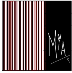
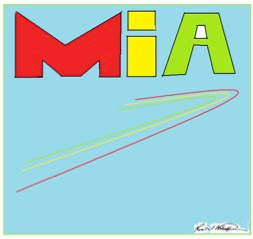
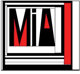
These ideas are basic ideas for a front cover. Some of the ideas are what colours we could uses and what colours would stand out more. Also on these covers I have tried some M.I.A logos and different fonts to see what would look the best and what would appeal more to our target audience. We decided not to use any of these front covers as they are just basic ideas. We would like the front cover to have the artist on the front to promote the CD for a new solo artist.
Labels:
By Charlotte
Tuesday, 24 November 2009
Kanye West's promotional products and artwork
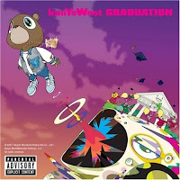
This is Kanye west album 'Graduation'. This is a digipack and folds out to a very interested animated design. I think the way in with kanye west has a running theme throughout his albums. He uses a teddy bear and also a educational theme for example 'college dropout', 'late registration' and then 'graduation'. The animated teddy bear is now recognizable as kanye west's work for example this is in some of his videos. Murakami's visual art is characterized by cartoonish creatures that appear friendly and cheerful at first glance, but possess dark, twisted undertones. The Japenese contemporary artist Takashi Murakami said this about the metaphor behind his art work:
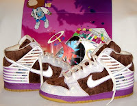
Here is an example of some of the promotional products that were released this helps advertising and exclusivity this helps the album to sell. In this photo it shows the poster that came in ever album, this is done to make more people buy the actual CD album cover. In this photo there is also a pair of very exclusive 'nike dunk high' trainers in the famous kanye west album design. This is a nice idea to create a promotional product and we would like to do this in our album.
Labels:
Robbie
Labels:
By Charlotte,
Rachel,
Robbie,
Will
Friday, 20 November 2009
For our own digipak.
We now need to think about making our own digipak for the album of the song we have just made a video for. We need to think about what we could include in this digipak and what it will look like.
As Charlotte is playing our main singer and therefore the would be the most recognisable person to our audience, it would make sense for her to be on the cover of our album. This would not only be publicity for the artist, but would help promote the album as we could use similar images on posters and postcards. The images we would most likely use from our music video are those where charlotte is infront of the graffiti wall, as this could help to develop a brand logo or 'tag', in graffiti terms.
In terms of being in the music industry, we would have a named artist supporting us to help us promote our album. For example, in the rap industry eminem took on 50 cent and helped him to become a famous rapper by promoting him in various ways. For example, his own project in one of his videos.
As our song contains repeated swear words, we would need to have a parental advisory sticker on the album cover, so parents are aware that some of the lyrics are not suitable for children. We would also need a barcode and price somewhere clear on the album cover for practical reasons.
Labels:
By Charlotte,
Rachel
Final Video
We decided to create a music video with a retro feel to it. We feel we have achieved this, and we are very happy with the final product. By using different editing techniques such as green screen, photoshop and final cut we have been able to create a realistic looking music video. The feel of the video gives the artist a brand which could easily be extended to a music video dvd and a live tour.
Labels:
By Charlotte,
Rachel,
Robbie,
Will
Thursday, 19 November 2009
Digi-pak research
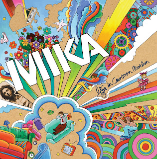
Although you cant see in this image, this album by MIKA is a digipak containing the CD and also a biography of the artist. The cover of this digipak is bright and colourful, making it appealing to a wide range of audiences. As it stands out, someone is more likely to look at this album than a plainer one, such as the oasis digipak we previously looked at. The title of the album is "Life In Cartoon Motion", this directly relates to the images we see on the album cover.
Labels:
By Charlotte,
Rachel
Digipak
DVD digipak!
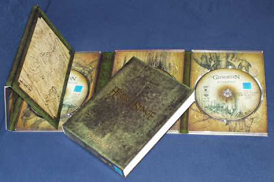
This digipak is promoting a DVD or game, it includes a book of the story what the DVD is based on. This digipak also includes a quest map on the side of the pack, this shows that this DVD might be for younger viewers. This also includes 2 discs one with a special effects and extra scenes and the other with the movie or game on it.
Labels:
By Charlotte
Digi-pak research
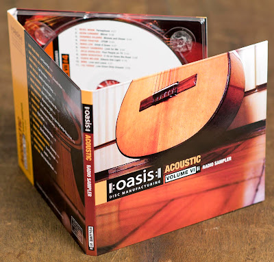
This is a picture of a digipak for a special edition of an oasis CD. This is a 3 fold digipak including 2 CDs, information about tracks and the artist. The artists name stands out on the cover by the use of white writing on a black background. The image of the guitar relates to the genre of the tracks as it is a special acoustic CD.
Labels:
By Charlotte,
Rachel
Tuesday, 10 November 2009
Finger movement
This is a video we made exploring the effects of having a finger move aorudn the screen which has been green screened we will add this effect in our final music video using the finger to click on different shots like in the video "fuck you by Lilly Allen"
Labels:
By Charlotte,
Rachel,
Rob,
Will
Friday, 6 November 2009
Filming Progress
First filming and planning we did was a Dancing performances which we used an actor to dance in front of a green screen, we also used props for this scene witch where, UV lights, bright Jewelery, green room, leg warmers, etc. Our next shoots where taken for our background which we used glow sticks and flashing lights to create bight backgrounds (which we got ideas from our research on other videos such as Black Eye peas).
Setting that we have used so far are, graffiti wall green wall and UV lights as a background setting, these backgrounds have been very successful for our filming, we just finished filming our of footage of lip syncing to the song MIA URAQT and is now loaded up and ready for editing into our final cut, we also need to finish other filming and create more backgrounds for our dancing performances.
Labels:
Charlotte