Media evaluation
1)
Representing music in a video is a relatively new phenomenon that has developed and grown over the last 40 years. As technology advances and improves so does our access to music and videos, with channels dedicated to showing music videos. In a sense our media product recognises and celebrates these advances in technology by creating the video within a video being shown on a mobile phone.
The recognition is that in order to survive the ever increasing advance in the technological environment, the music video industry must also keep moving forward. Our media product tries to capture this concept in its creation and its delivery.
The technological advances in video production have also meant that artists can quickly and easily reach a worldwide audience. However, specifically within this vast potential audience, it can target a subculture that identities and supports a particular brand or style of music and video. It is this image and brand, as much as the music, which promotes itself. Our media product creates a clear brand with the perceived culture that “Mia”, together with her ideologies, represents. However, in many ways our product uses conventional forms through the location used and the artwork design to reach the intended audience.
The success of the media products, poster and DVD, is ultimately dependent upon how the audience demonstrates their association with this genre.
I believe that our commitment to the artwork, the style and the presentation contribute to following the ‘Mia’ conventions which coincide and develop her image as an urban musical artist. We used a number of conventions that help to identify the genre: the location of a graffiti-covered wall as well as the constant energetic beat and non-stop movement of Will, the close-up and bold angled shots of Charlotte; these are some examples of how the techniques and conventions we used to help create an urban music genre.
Artists in recent times that have used a similar approach to performance include artists such as ‘the black eyed peas’ and ‘technotronic’. In their videos the conventions are very similar in the way that they focus on a person performing within a recognisable genre-setting to achieve an urban effect, image and style. Our approach in the video was to adopt similar techniques, for example the use of green screen was a process that the ‘technotronics’ chose in their video ‘pump the jam’.
The poster, DVD cover and video create a clear brand and the target audience will consume this music and its associated culture through the medium in which we present it – through a mobile phone.
As a consequence, the media product we have created is a very neat, compact, targeted and modern product.
Despite using relatively conventional techniques, I believe that the products are sufficiently close to the edge of technology and presentation. It is at the edge where the maximum potential return is possible, which is the aim of the production company and us as a media group.
2)
Popular music is increasingly surrounded by the genre associated with the type of music. Genre is now fundamental to the presentation of the music. It is not only limited to the actual track but the selling of the product is now packaged as a total concept in relation to the music.
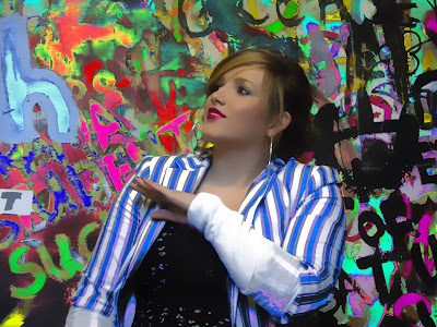
In our presentation of the combination of products we have tried to maintain a consistent and common set of values in line with the genre associated with ‘Mia’. The main product, our music video, in my opinion fits very well with the ancillary texts of the poster and DVD cover. The location is consistent and the artwork and theme is the same giving the audience a modern day, urban life feel. The street life theme flowing throughout the product gives the audience an easily recognizable product range almost like a logo. An example of this is the presentation of Charlotte as bold and confident in her attitude and approach. She forms part of a changing and often vibrant colour scheme that at times seems abrupt and stark in its appearance. This as well as the distressed logo, which has been deliberately vandalised, do suggest and emphasize the street theme. It works because the conventions of urban life are not soft and gentle but can be hard and brutal.
We have kept within well defined boundaries of the genre conventions and expectations of the target audience. This application of a consistent theme we believe will be very useful in selling the package as a whole. The audience will have no problem in recognising the genre and identifying with their chosen genre. In this way the artist ‘Mia’ has been used to create a carefully constructed ideology that will mean clear identification of a brand. The marketing people will present this brand of the ‘Mia’ image. Once a brand is accepted and recognised, the selling becomes much easier.
Our ancillary texts do reflect the main product in style, content and particular brand. Using a photo from the music video for the poster meant that it gave us a honesty to the audience and a real feel of what to expect. This commitment to truth without deception is a principle that the ‘Mia’ genre sticks to and so we felt that its importance should be reflected in the whole presentation of the package as a whole. We also felt it was important to keep the same artist and song name as it gave us a good simple basis to work from and create a successful poster and DVD cover.
3)
Audience feedback is a critical part in the process of improving and refining our media product. Feedback shows us how the product has been received by the audience. It is vital that we access this feedback to see if we should make any changes in the content or presentation. In a sense it is similar to market research used in many different types of disciplines.
The official feedback has been posted on our blog. We have had 3 comments on our main music video and 3 comments on the DVD magazine advert.
In general the feedback has been very positive both from these comments and the informal feedback that has come from people who have seen the product and I have spoken to.
“Great music video9, good lip syncing and the style, background, clothes and characters all work really well with the music”. It is really encouraging that all the effort gone into presenting a convincing picture of the product seems to have been received very well. The consistency of presenting the genre throughout the video has been acknowledged by this feedback.
The second comment on the video describes how the techniques and “style of the late eighties, through technotonic, inner city, s.express which also used basic green screen effects and abstract patterns behind is back in vogue”. This confirms our belief that the video, we felt, was of the moment and in no way felt ‘dated’. Although it does have, as the feedback comment suggests a retro-feel to its presentation and look. The comment about the iphone providing a bookend start and finish is exactly what we wanted to achieve and therefore was very pleased with this feedback.
The fact that an extra performance would have made the cut “snappier” is perhaps also true. An extra location would have helped, but we wanted to be absolutely sure that the performance was in the right style. Finding such a location was hard, so we stuck with what we had and decided not to risk introducing another element which may have unbalanced the product.
The feedback on the DVD was also positive. The “it looks painted” and “surreal” was a look that we were trying to achieve along with the unusual title presentation. However I do agree that the extra information i.e. the written content could have probably been a bit more “interesting”. Perhaps we could have included further references to the urban life – with maybe a neon light effect or perhaps “a public information notice/street sign” title. This would personally be something I would do differently if we were to do it again. However we certainly wanted to make this very easy to read, as any uncertainty or lack of clarity my effect the sales. The existing presentation does look clean and uncluttered and doesn’t distract from the artist image and the title.
Again the focus on the artist was central to the theme as was the bold colours and the “garish” feel to the product, which help well with the retro feel of the product. The intended bold, confident and ‘in your face’ approach to the products seems to have been very well received which gives us confidence as to its likely success.
4)
Media is all about presentation and representation of ideas. The presentation of our product involved using new media technologies to present the product. However we also used these new types of technology in the research, planning and evaluation stages of our final work.
In the construction of the product, new technologies such as ‘Final Cut’ were used throughout the making of our video. Final Cut allowed us to use green screen as it has a programme in which it recognizes all the green, then takes it out which enabled us to put our moving background behind will. It provided an efficient way to edit and refine the production to give it a visual appeal that makes it stand out. This technology also enabled us to create simple but clear effects throughout the product. The number of options available from this technology meant that we could get the exact image that we were looking for.
‘Photoshop’ was a program used throughout the design stage of the product for the DVD and poster. It again allowed us to make the adjustments to the original picture in order to maximise its appeal to the target audience. We made the photo of Charlotte brighter and more vibrant through the use of Photoshop.
The internet was used very much in the research stage initially. Ideas for graphics, animation and basic layouts came from the significant research from browsing the web. The internet also helped to provide the background and information on ‘Mia’ culture and music. It also provided many examples and techniques used by other products. It was with all this that images and ideas formed for our own work. It is difficult to measure how things influence you but all input is always helpful even when searching for and making original work. I believe it’s a big help when trying to think of original ideas.
Blogger.com also helped to provide a way of receiving feedback, which was very useful in assessing what things worked and how things could be improved. This evaluation stage was an important part of the product release.
There is no doubt that nowadays it is essential that new media technology are an important tool in all stages of production when producing a media product such as our music video, DVD cover and poster.
We were able to do huge amounts of research and gather lots of information. It enabled us to construct the product with up to date software. The new media will be used to evaluate and distribute the product to the specific audience within the world-wide market. It is the increased speed of communication and alterations that is so useful. The technology is changing so rapidly that when making a media product you must use it quickly and effectively to make your product work and be successful.
Will Wise's Evaluation
Media Project Evaluation
1) Our media product uses many forms and conventions of real media products; our media product is a performance based video which includes a lot of dancing that is used in real music videos for the genre of our audio. Examples of real products which have many conventions similar to our product. It also develops real media products with the use of the green screen in our product; it allows us to view various backgrounds in the style of real media products such as Pump The Jam by Technotronic this video is similar to our product as it uses bright colours and a green screen to give the effect of a retro background, while dancing in front, the effects we used as the background for the green screen made the performance more dynamic. The female lead is the main focus in our video so we’re able to develop the artist reputation we also use lip syncing which is used in real media products such as In Da Club by 50 cent which is a video that has 50 Cent as the main focus building up his reputation as it was one of his early songs. In parts of the song the dancer has lots of bright UV clothing and jewellery on which is a convention that is used in many real products such as I Gotta Feeling by Black Eyed Peas which they use Glow in the dark paint and UV lights. Live performances and music videos are the main real media products that relate to our product which I believe we have done successfully. I believe that iTunes and HMV would be the two main media institutions that would stock and distribute our music video, as they specialise in popular and new music.
2) Our main product and ancilliary text combinations relate together to give a good effect as they compliment each other. By keeping a bright colour theme through out, where the artist is wearing bright clothes as well as the dancer, this is so we can represent the retro theme through out the product as the dancer is wearing glow sticks and florescent colour clothing to add this effect, also on the ancilliary text DVD cover the background includes lots of bright colours, the title has fading multiple colours in the background also represent ting the retro theme. The artist who is a strong female lead is shown a lot throughout the video as she is the main focus of the product therefore she is presented on the front of the DVD cover of the ancilliary text. The DVD cover and the Magazine advert have the same style and pictures as each other I believe that this worked to great effect as if someone was to see the advert and want to get a copy of the DVD they would recognise the advert and be able to find the DVD a lot easier.
3) We have learnt quite a bit from the feedback received from other media studies students and our teacher. Our teacher gave us some constructive feedback about the performance in our video one critism was we could have had more performance based shots “It could have done with one more performance to enable you to make the cuts snappier” to make quicker cuts making it overall more effective as a performance based music video, this is defiantly something I would change if we were to do the project again as a lot of the shots are of the same thing but I believe we have hidden this successfully with the editing. The audience which was intended for the media product is for both males and females aged 16-21 we have aimed it to this age group as they are more interested in the bright colours and urban settings, We have played with the audiences expectations by giving the music video a urban edge to it but also used some dance/techno conventions in it.
4) We used lots of new technologies in the making of our final product; one of the technologies was the use of final cut which is the program we mainly used from constructing our product. It gave us space and the ability to edit the product to a sound standard and add lots of effects to the product which worked successfully. We also used green screen technology for our product which we used to add different backgrounds for some of the dancing footage this enabled us to save time during filming as we could get a great deal of it done in one location and changed the background when it came to the editing instead of moving on to different locations, I believe that the green screen was extremely successful as it turned out exactly how we had imagined it while we were planning and it also made the performance more dynamic. We used photo shop to create our DVD cover which let us edit the cover in lots of detail which worked successfully but I would have liked to spend more time on photo shop to create more detailed and better effects for our product. One of the effects I am most pleased with in our product is the iphone at the beginning and end of the song opening and closing the video made it look more professional, with this we combined the green screen to get a hand to look like it was clicking on the screen to bring up different shots and expanding them. During making the product my skills developed greatly on some of this new technology most of all on the green screen since I had never used it before and believe it has turned out quite successfully.
Charlotte Thompson's Evaluation
Evaluation questions
1. in what ways does your media product use, develop or challenge forms and conventions of real media products.
In our media product we develop and change a well known artist M.I.A, song URAQT and develop it into our own media product throughout our media performances we used lots of different conventions. We used these conventions in, performance, lip syncing, acting and continuity editing, we also used media conventions in our diggi-pak and posters and the postcards we produce. The main convention that we used where photo shop and final cut, these conventions helped us develop skills and sell our media product as a real product. In our performance we used dancing and lips syncing these were ideas for performance to get the image of the artist and the attitude of the artists and to also help sell our product to the right target audience. Photo shop, was where we produce our diggi-pack, we change the artist (me) to make her stand out more, we did this by changing the colour of my jacket and also changing the background to make certain colour stand out more than others. The backgrounds that were used the music video where also used and develop on the photo shop, in one scene where we have will, the dancer dancing we change the back ground on photo shop in to a kaleidoscope effect, this back ground was very effected and gave of a retro image to the look of the artist and the dancer. Other ways of using media conventions where using the phone as an ironic development to the lyrics of the song. This idea was them develop into the video of having the whole music video on the phone. We were able to create this effect by taking an image of a phone (I phone) and placing it on to photo shop then we were able to play around with the image and decide how this idea was going to work. We final decided as a group to have the phone at the beginning of the video and have the effect of the phone zooming in and then using the green screen to film a hand that would be touching the screen for the shots of the dancer to pop up. When filming we decided to use only a few of different back grounds. When using final cut we have to get the mise-en-scene right when changing scene if not, this would have an effect on the continuity of the music video and not look right. These changes where easy to make and help also to make our video stand out more using these conventions
2. How effective is the combination of you main product and ancillary text?
Our music video is target for a wide range of different types of music genre, it ranges from hip hop, to a retro rock to a slightly gangster rap, because our music video hits all these target audiences we had to think on what aspects of the video and song would sell. In the lyrics there was a lot of raping and repeated lines, we decided to use this and at the end of the video chop at the line “DT-DT-dt- n your mobile phone” and whenever I said this line in the last minute, to use different angle shots so that the effect of the repeated line would make an impact on the artist. In our music video I think we hit the right target audience and were very pleased about our music video and that we achieved the right genre. In the music video our main focus was promoting a solo artist with a new hit single. We thought that M.I.A, URAQT was an upbeat and catchy song that if we where promoting this video for a real media product the song would catch on. To interlink the music video to the artists we had to combine the combination of the artist and the video together to do this we had to look at a stereo type music video to this song. We also looked at other videos that M.I.A done, and other artist like the band Black-Eye-peas, this band was a great inspiration to our music video and help with the green screen effect and the attitude of our video, as I was the actress acting I found it hard to act in a different attitude. The setting and background are both effect to the artist and the song. These help create a suitable performance with combining all the effect together to help to produce a music video.
3. What have you learnt from your audience feedback?
After posting out video and diggi-pack onto our blog we decided then to ask other students and teachers what they thought about our music video and how we could improve it, from our feedback we got many different responses some were criticism and some was bad but most of our feedback was good and could help us into improve our music video and also talked about in our in our shot video clip where we talked about our music video. The criticism that we got was about our green screen and how we used it. The green screen took a lot of time to do, this was not good for when we had to put our video together and also delayed time, which we could of spent touching up edges instead of preparing our green screen we also wasted a lot of time not planning what we should have been doing in lesson and while we were debating what we were going to do, we could have been writing these points of ideas on our blog. The good comments were about the look and theme of our music video, some of our comments were also about the lip syncing and the performance of our video, witch a lot of people said was brilliant and well put together and also the linking in scenes together people said worked well with the artists and image the artist was giving of. We also posted our music video on YouTube and in our first week reach 133 views. We have yet no comments on YouTube yet. Other feedback we learnt from our audience was about the background and mise-en-scene. We also got some good points and bad points, some of the points were about the style and theme of the music video. The good points about our video where the graffiti wall and the colours we used throughout the music video and also how the colours were effective with the attitude of the artist. Bad comments we got were there about time we spent on preparing the performance and that should of spent more time planning so that we were able to take more shots and may of used different settings. We took this and decided that we could have planned our music video more and also could have done a time sheet where we could draw our scenes and that put then on photo shop and then made a shot video using idea from this to help develop our music video. Over all I think our comment were suitable for our music and the feedback we got from people we were able to collect and develop into our blog as a show of how good our music video would have been on the market and also to show how we could change and develop our product.
4. How did you use new media technologies in the construction and research planning and evaluation stages.
When using new media technologies in our music video we spent time on developing our music video from these conventions. Thought out our media video we used photo shop, final cut, and paint. These are some of the new media technologies that we used in to making and producing and promoting our music video and our diggi-pack. In our planning and research we were able to construct a foundation which we picked and develop ideas for our music video from. In different stages of our video we change many ideas and ended up with a different idea then we started from. One of our first ideas where to use UV light and do our whole music video in UV this plan did not work because we were not able to produce any UV paint and it was very had to all ways find a black / dark room to filming in all of the time, since you only have a certain amount of time to film in. By using these technologies we were also able to use green screen and photo shopping pictures in to develop then into moving images this was shown in our video when doing our phone in the front and at the end of our video. In our music video I think that we achieved a standard witch the video was a suitable video for the genre we aim at and was able to receive a different look by looking at a solo artist rather than a band. When listening to the song we realizes that we had a lot of track to cover with footage, this became a problem when because we didn’t have enough time so by using photo shop we were able to cut out 44seconds this helped us have more footage for our video. By having the song to long it might drag on and might lose viewers. After finishing our music video we watch it many times to make sure we had everything in place! We also added a colour effect that we done on photo shop, we added this effect to the artist on the promoting diggi pack too.
Rachel Monaghan's Evaluation
In what ways does your media product use, develop or challenge forms and conventions of real media products?
Our music video uses, develops and challenges conventions of real media products. In any music video, not necessarily just of the dance genre, the audience would expect to see some kind of performance involving lip syncing by the artist. We included many performance shots. Throughout these we insured we included many different shot types such as an extreme close up, an above angle shot, a below angle shot and a long shot. This is so the audience would stay interested in the video, also the use of occasional jump cuts between shots is conventional of the dance genre as it fits with the jumpy beat of the music. In any music video, the audience would expect there to be some sort of story line or acting from the artist. As our lyrics tell a story for themselves, we had to make sure Charlotte was acting slightly as she was singing to make the video more believable.
As for mise-en-scene, the use of a graffiti wall as our main location is very conventional of the dance genre. For example, in many M.I.A music video’s she uses graffiti or other gang related images as backgrounds to emphasise the attitude of her songs. As the perceived attitude of the artist plays a main role in making most music video’s believable, the clothing of our singer was very important. Our artist, Charlotte, was wearing a bandana in the video, this again relates to a sort of modern gang culture making it very conventional of the genre. In the long shots of charlotte she is sitting on an amplifier, as dance music is often about being played as loud as possible this is again following conventions.
The use of green screen in our music video both uses and challenges conventions of the dance genre. Whilst some older music videos such as “pump the jam” by Technotronic, made in the 80’s, use this same effect, modern dance video’s have become more about looking into the future than the past. While the retro style has become very popular amongst the teen age group, this is more related to the indie style genre. For example, the music video by the mystery Jets, “Two Doors Down”, uses a lot of green screen with patterned backgrounds to create the retro effect. However, modern dance videos such as “Paris to Berlin” by Infernal use a lot of futuristic props and colours, like bright neon pinks and blues. We challenged this convention by using green screen in our dance video. This makes it different from what the audience might expect to see in our video, however we have included modern twists such as the image of the iphone.
How effective is the combination of your main product and ancilliary texts?
We had produced products; the music video, the poster and the DVD cover. The poster is supposed to attract the audience and make them buy the DVD, once they have bought the DVD they will then watch the video. The audience would need to recognise these products instantly as being by M.I.A if they were to easily do all 3 of these things. Firstly we had to create a brand that would be recognisable to the audience as being related to the artist.
We decided that our target audience would be teenagers. To attract this audience we used bright colours and a young main artist. We tried to incorporate bright colours on all three of our products. In the music video our bright colours were part of the setting, the graffiti wall, and the props, the bright blue pompoms. The DVD cover and the poster share the same background, this is a bright, colourful, stripy pattern. This combination makes the product very eye catching to the audience, and recognisable as a package. These two products also have the same “M.I.A” logo on them. Many albums’ are released and advertised using images of the artist as the focus point. For example, Leona Lewis’ new album cover is simply an image of her on the front cover. We used a similar style as our DVD cover and our poster have a big picture of charlotte on the front, as charlotte is also the main focus of our music video it makes sense to have her advertising the product as well.
In the video, Charlotte is seen to be dancing and telling a story through lyrics. Often the teenage market wants to relate to situations portrayed in the video, especially events to do with relationships. Our video provides for these needs of the audience as it is telling a story of two girls fighting over one boy.
What have you learnt from your audience feedback?
As our target audience was teenagers, getting feedback from fellow students in our college was the perfect opportunity for us. From our audience feedback I have learnt that it was effective to use bright colours on all three products and the M.I.A logo. I have also learnt that promoting Charlotte as the main star in all the products projects an effective image to the audience, as one person said “conscious effort to promote Charlotte as the star.” The effects we used on Charlotte also make her stand out as the star even amongst the bright colours we used as the background. The bright colours also fit in with the retro feel we have tried to create in the video. We found our one weakness of the advert and the DVD cover was the lack of information about what was included in the DVD, it was also suggested we could have made the extra information font a little more interesting on the back of the DVD as it fails to stand out against the bright colours of the background.
From our video feedback we learnt that we achieved the desired effect of creating a retro style video, as someone left feedback saying “It's a lot like the late eighties videos such as Technocronic” in the early stages of planning we used this video as inspiration. We originally had struggled to come up with an effective opening and ending to our video, we eventually decided to use zooming in and out of an iphone, we were also left feedback saying this was very effective. The only negative feedback we received was that we could have included one more performance scene to make the shots “snappier”. Overall we are very pleased with our audience feedback as we now know that our products are appealing to our intended audience of teenagers.-“Great music video, good lip syncing and the style, backgrounds, clothes and characters all work really well with the music.”
How did you use new media technologies in the construction and research, planning and evaluation stages?
Throughout the research and planning stages, our main media resource was youtube.com. On this website we researched and analysed many existing music videos such as “pump the jam”, technotronic, and “gangalang”, M.I.A. Analysing these video’s using Goodwin’s theory helped us to decide what features we wanted to include in our own music video, also to discover what conventions we should include. Looking at other music video’s showed us how to relate lyrics to visuals through props and acting and also how to incorporate certain techniques such as the green screen.
Our first idea for the construction of our music video was to use the green screen. To do this we set up big sheets of green paper on a plain wall. We filmed our footage, which were shots of Will dancing, in front of this screen. We then uploaded this onto final cut and began editing. We needed to make a brightly coloured background to have behind Will while he was dancing, to do this we filmed a short clip of some glow sticks shining in UV light. We then used the “kaleidoscope” tool on final cut to turn this image into a moving brightly coloured background. Then using the green screen tool we inserted this background behind Will.
For the rest of our footage we filmed multiple shots of performance scenes, we then had to edit these together carefully so lip syncing was in time with the music and the shots blended together nicely. To make sure the lip syncing was in time, we placed the footage onto final cut above the track. We marked the track using the marker tool whenever a significant point of the music appeared, such as the point of the lyrics “U.R.A.Q.T” we then marked the footage at the point where Charlotte was lip syncing these same lyrics and lined them up. To make sure the clips didn’t jump as they cut from one to another we used the blend tool. To do this we made the clips overlap slightly and had one slowly fading out as the other faded in. Finally, to fit in with the retro style of the video, we placed a filter over each clip in which we edited the colours to make them a bit brighter than they were on the original footage.
To make our DVD cover and advert, our main tool was Photoshop. We took a still image of charlotte posing and placed this onto Photoshop. As many artists do, we airbrushed this picture using different layers and the “surface blur” tool to make her look flawless. We then produced a bright coloured background and a bright logo.
To evaluate our work, we filmed ourselves talking about the project. Using final cut we created a commentary style video as seen on many DVD extras. To show what we were talking about in the commentary we inserted clips from ours and others video’s, also still images of our ancillary products to provide a visual image to the audience.
Sunday, 29 November 2009
DVD magazine advert

This advert looks very similar to our dvd cover, we did this because we wanted to recognise our dvd as soon as they saw it on the shelf . I also think this is a very stiriking image, so would stand out on the page of a magazine. We included the date the album is out, which well known songs will be on it and also the website they can visit to get more information.
Our dvd album cover!

This is our final dvd album cover. On it we have included all the conventions of a dvd album cover, such as the song list, the 'dvd' logo and we made sure to include the parental advisory logo as one of our songs in particular includes swear words. We decided to use an image of Charlotte on the front cover, as she was featured as our main singer in the video, so she would be most recognisable to the audience and so just by looking at the front cover they would be able to tell that this DVD is by M.I.A. We produced this dvd using photoshop. We had an origional picture of charlotte on a plain white background which we airbrushed, cropped and then inserted onto this bright background. Continuing the theme of bright colours, we made a logo for our band. The writing we used has a patchy effect of white writing with bright colours in the background, this makes it look slightly like a graffiti sketch, therefore making it appealing to our audience of teenagers and also relating directly to our feature video, URAQT, in which the preformance was done infront of a graffiti wall. We also made sure to include the practical element of a barcode.
As we wanted our dvd to include something other than just a dvd, we created an exclusive postcard that can come free inside the dvd cover. This can be put on walls or kept as a souveneer of the dvd by the person who purchased it. This is our exclusive postcard:
 This would be a recognisable image to someone who had seen our video as it is taken where the video was filmed. To make this postcard we edited our origional photo using the colour replacement tool, we used this to make the real colours of the photo more vibrant and aesthetically pleasing for the audience.
 Examples of existing covers:
 As one of the aims of this whole project for us has been to create a product which looks retro, as retro or vintage products are currently fashionable. This is an album cover for Technotronic, Pump Up The Jam. It was produced in the 80's so therefore a good product to compare our own too. Similar to ours, the singer is the main focus. She is also surrounded by bright colours.
Sam Sparrow, while being a current artist, is known for being very 'retro' and also producing retro looking album covers. Interestingly, this album cover looks very similar to our 'M.I.A' logo. Both our logo and this product have an image with splashed bright colours in the background showing through.


Thursday, 26 November 2009
Ideas for CD cover


These ideas are basic ideas for a front cover. Some of the ideas are what colours we could uses and what colours would stand out more. Also on these covers I have tried some M.I.A logos and different fonts to see what would look the best and what would appeal more to our target audience. We decided not to use any of these front covers as they are just basic ideas. We would like the front cover to have the artist on the front to promote the CD for a new solo artist.
Tuesday, 24 November 2009
Kanye West's promotional products and artwork

This is Kanye west album 'Graduation'. This is a digipack and folds out to a very interested animated design. I think the way in with kanye west has a running theme throughout his albums. He uses a teddy bear and also a educational theme for example 'college dropout', 'late registration' and then 'graduation'. The animated teddy bear is now recognizable as kanye west's work for example this is in some of his videos. Murakami's visual art is characterized by cartoonish creatures that appear friendly and cheerful at first glance, but possess dark, twisted undertones. The Japenese contemporary artist Takashi Murakami said this about the metaphor behind his art work:

Here is an example of some of the promotional products that were released this helps advertising and exclusivity this helps the album to sell. In this photo it shows the poster that came in ever album, this is done to make more people buy the actual CD album cover. In this photo there is also a pair of very exclusive 'nike dunk high' trainers in the famous kanye west album design. This is a nice idea to create a promotional product and we would like to do this in our album.


Friday, 20 November 2009
For our own digipak.
We now need to think about making our own digipak for the album of the song we have just made a video for. We need to think about what we could include in this digipak and what it will look like.
As Charlotte is playing our main singer and therefore the would be the most recognisable person to our audience, it would make sense for her to be on the cover of our album. This would not only be publicity for the artist, but would help promote the album as we could use similar images on posters and postcards. The images we would most likely use from our music video are those where charlotte is infront of the graffiti wall, as this could help to develop a brand logo or 'tag', in graffiti terms.
In terms of being in the music industry, we would have a named artist supporting us to help us promote our album. For example, in the rap industry eminem took on 50 cent and helped him to become a famous rapper by promoting him in various ways. For example, his own project in one of his videos.
As our song contains repeated swear words, we would need to have a parental advisory sticker on the album cover, so parents are aware that some of the lyrics are not suitable for children. We would also need a barcode and price somewhere clear on the album cover for practical reasons.
Final Video
We decided to create a music video with a retro feel to it. We feel we have achieved this, and we are very happy with the final product. By using different editing techniques such as green screen, photoshop and final cut we have been able to create a realistic looking music video. The feel of the video gives the artist a brand which could easily be extended to a music video dvd and a live tour.
Thursday, 19 November 2009
Digi-pak research
 Although you cant see in this image, this album by MIKA is a digipak containing the CD and also a biography of the artist. The cover of this digipak is bright and colourful, making it appealing to a wide range of audiences. As it stands out, someone is more likely to look at this album than a plainer one, such as the oasis digipak we previously looked at. The title of the album is "Life In Cartoon Motion", this directly relates to the images we see on the album cover.
Digipak
DVD digipak!
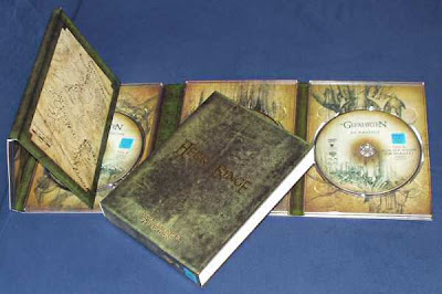
This digipak is promoting a DVD or game, it includes a book of the story what the DVD is based on. This digipak also includes a quest map on the side of the pack, this shows that this DVD might be for younger viewers. This also includes 2 discs one with a special effects and extra scenes and the other with the movie or game on it.

This digipak is promoting a DVD or game, it includes a book of the story what the DVD is based on. This digipak also includes a quest map on the side of the pack, this shows that this DVD might be for younger viewers. This also includes 2 discs one with a special effects and extra scenes and the other with the movie or game on it.
Digi-pak research

This is a picture of a digipak for a special edition of an oasis CD. This is a 3 fold digipak including 2 CDs, information about tracks and the artist. The artists name stands out on the cover by the use of white writing on a black background. The image of the guitar relates to the genre of the tracks as it is a special acoustic CD.
Tuesday, 10 November 2009
Finger movement
This is a video we made exploring the effects of having a finger move aorudn the screen which has been green screened we will add this effect in our final music video using the finger to click on different shots like in the video "fuck you by Lilly Allen"
Friday, 6 November 2009
Filming Progress
First filming and planning we did was a Dancing performances which we used an actor to dance in front of a green screen, we also used props for this scene witch where, UV lights, bright Jewelery, green room, leg warmers, etc. Our next shoots where taken for our background which we used glow sticks and flashing lights to create bight backgrounds (which we got ideas from our research on other videos such as Black Eye peas).
Setting that we have used so far are, graffiti wall green wall and UV lights as a background setting, these backgrounds have been very successful for our filming, we just finished filming our of footage of lip syncing to the song MIA URAQT and is now loaded up and ready for editing into our final cut, we also need to finish other filming and create more backgrounds for our dancing performances.
Wednesday, 14 October 2009
locations we used in our music video


we used this background in our music video because it is urban which goes well with the song.
We also used this green screen which gives us the opportunity to use various backgrounds and also gave us the option of using a moving background which we took full advantage of.
Monday, 12 October 2009
Today I found some UV lights which I have been given permission to borrow. I will be bringing them into college tomorrow and hopefully we can do some test footage to see if we are happy with the effect they give
Thursday, 8 October 2009
The outhere brother 'boom boom boom' analysis
This video follows similar conventions for example there is no narrative. The chemical brother's video has a great use of colour which we aim to create in our music video. However this is very cheap video with very few different shots types.
Wednesday, 7 October 2009
http://www.myspace.com/mia
This is a link to M.I.A's music myspace. Simply from looking at the bright flashing background and the bright colours and retro style photographs used throughout, I am confident that our ideas for the music video fit with the style of the artist and also with the style of her other songs.
This is a link to M.I.A's music myspace. Simply from looking at the bright flashing background and the bright colours and retro style photographs used throughout, I am confident that our ideas for the music video fit with the style of the artist and also with the style of her other songs.
Tuesday, 6 October 2009

This is a message we sent to M.I.A through their myspace. Although they are unlikely to reply, the issue of copyright means we should ask the artists permission before we use their song to make our music video.
We took this clip off the talk talk x factor advert. If we can achieve the same effect, we think this would work well in our music video . The only problem with this is you have to send your clip off to the x factor and they put the effect on it for you, we are not sure that they will then send us the clip back. Therefore we will need to work out how to achieve this effect for ourselves
Saturday, 3 October 2009
We still need to add an intro to our video which we decided would be zooming into a phone. Hopefully using green screen, we will be able to create the effect of someone touching the phone. We also need to edit the cuts between some of the shots as they are quite jumpy, we can do this by using the fade tool. We also have 45 seconds of music on our rough cut (from 00:49 to 1:33) that we are having cut out. We also need to add an ending, we have had some ideas to reverse to phone on the intro, so zooming out of the phone.
Friday, 2 October 2009
This video uses the green screen technique. We would like to try and use this same technique for our own music video. The style of the song in this video is quite similar to ours, for example repeated words/ phrases and an upbeat tempo. This video also has similar dance scenes to the ones we are looking to create in our own music video. Although the genre is a bit different and the style of the video is set in the 80s so a little dated, we would like to recreate the colourful theme and retro feel of "pump up the jam".


These are some screen grabs from final cut that we have captured to show our progress in producing our music video. We have long shots of footage which we will cut down into short pieces to make our final music video.
Thursday, 1 October 2009
Green Screen Practice

Wednesday, 30 September 2009
Here is some test footage which we filmed today. This was to check that the UV lights work effectively. We are happy with the effect they give, so we will be trying to encorporate this effect into our music video
TimeLine & Pitches For Story Board.
Timeline and Pitches
· Our song is 4:09 minutes long. In this video we are planning to have many different backgrounds including a wall covered in graffiti, a dark room and a green room for computerised images. We also need to make sure that we have plenty of footage for the amount of time in our video.
· When designing our music video we need to decide on what order of preference the frames will be for the video. Even though we are not having a story line or a narrative we need to make the video link in order from frame to frame.
· Our story line will help us decide what frames will look best together. By drawing a story board we will have an idea on what location we will need to film and create in the green room and also help us to plan time management and have enough time to film and prepare our rough cut, and then we will be ready to develop our final cut.
Ideas For Music Video & Planning!
Ideas for the music Video & Planning!
• When deciding over the music video we initially decided that we weren’t going to have a story line going on in the video but we were going to have mixed views from individual personalities within the video that relates to the theme and genre of the music.
• Other ideas for the video included the chorographer, designing the dance routines to involve either one dancer or several dancers, break dancing on the floor while getting fluorescent paint either thrown on then or having their hands and feet all ready painting so that in the dark room you could see where the dancers are by the paint glowing in the dark. We could also adjust and manipulate this idea by having the movement of the wave lengths to the beat of the rhythm. This will give a visual aspect of our song vibes through the moves of the dancers.
• We were also thinking of having animated writing in the video where there are repeated lyrics. The writing will be bright and bold and will move to the beat on the song. This will also link in with the retro theme of a kaleidoscope of colour images displayed on the screen to make an impact on the viewer.
• Our video will be more abstract to the viewer and could be critical review and analysis by the target audience of this gender. This also means we have chosen not to have a narrator to tell the story within the video.
Costume/Props/Location
Costume/ Props
COSTUME!
1. Clothes- (based on rave theme)
· Bright tights 
· Plane T-shirts
· Leg warmers
· Sweat bands
· Bright Jewellery
· Basically everything BRIGHT!
PROPS
2. Props-
· Lights, UV lights
· Colour cellophane
· Glow sticks 
· Fluorescent paint
· Green room
· Graffiti wall
· Maybe Car
LOCATION!
We decided that we would prefer to use the green room for our main background but other ideas where,
· Graffiti wall
· Dark room
· Wall under bridge, ( Graffiti Is)
· Green room, using different backgrounds we download of the internet or picture that we can take to use.
· Outside at night, car park or deserted area, field.
· Inside a car
All possible ideas for our music video.
Lyrics For MIA- URAQT
"URAQT"
Dt-Dt-Dt On your mobile phone Dt-Dt-Dt On your mobile phoneYou Fuck my Man and Wreck my home,I'll get my bro to rob your phone [x4]
You Big Dummy
Now Could it be that me and He Are tighter than J-lo in her jeans And Could it be that me and HeAre tighter than R.Kelly in his teens You fucking With My man And you text him all the timeYou might've had him once But I got him all the time
Dt-Dt-Dt On your mobile phone Dt-Dt-Dt On your mobile phone You Fuck my Man and Wreck my home,I'll get my bro to rob your phone [x2]
U R A Q T
Is your Dad a dealer Cause you're dope to meYou Throw them Balls across the country You win gold medals for when you're with meYou Big Dummy
Right then, It's On [x8]
He ain't no Word for scrabbleYou don't get points for doubles Menage Trois Lalalalala I'll bill you for your droudlesYou done lost your marbleLike a ball I'll make you dribbleYour the shrapnels in the rubbleI'm a raging bull, a rebelIt's all about the low-blow brown GirlThe No blood, no Love hot girlThe jnkn jnkn jumping off the decks girlThe jnkn jnkn jumping off the rocks girlYou big Dummy
U R A Q T
Is your Dad a dealer Cause you're dope to meYou Throw them Balls across the countryYou win gold medals for when you're with meYou Big Dummy Right then, It's on [x16]
You Big Dummy!


These are some photos that we have chosen for our background themes, or for just ideas that
can be deleop into final ideas that we might use in the green room. we will have to create our own background for the shots where we use greenscreen. We can do thia by filming an image of a
variety of bright colours, and using the Kaleidoscope effect on final cut.
Mystery Jets:
I have chosen to analyse this video because it is very similar to the kind of video we want to create in that they make it look very retro and they also use the green screen effect. I will also analyse this video using the points of Goodwin's theory.
This video is quite simple in the way that the lyrics are very complimentary to the visuals. The first of these is when we hear the lyrics "I hear her playing the drums late at night", we see a girl playing drums. This is shortly followed by the lyrics "maybe i should call her up", we see the main singer picking up a phone. As the song is called "two doors down" throughout the music video we see a lot of doors, mainly surrounding the band as they do their preformance.
The song is about a boy who is 'in love' with a girl who lives in his street, but who has never spoken too. This video creates a strong sense of voyerism in the fact that the girl may not know he is looking at her. Through points in the video we see the band standing behind a window looking at the girl, while this created the notion of looking it also shows the objectification of women as being nice to look at.
The use of green screen in this video does not directly relate to the lyrics in anyway, however it amplifies the 'retro' feel of the video. The greenscreen effects we see are usually bright colours in some form of pattern, such as leapord print. The retro feel is also emphasised by the artist's clothing, hair and general apperance.
Tuesday, 29 September 2009
Here is another music video by M.I.A, as it uses many of the effects we wish to use, I will be analysing this using Goodwin's Theory. These are the elements I will look at:
Links between Lyrics and VisualsLinks between Music and Visuals (Complimentary, Contradicting or Amplification)Genre characteristicsIntertextual referenceNotions of Looking (objectification of women)Voyerism (direct gaze, other people looking at artist, insight into artists life, screens and mirrors)Demands of the Record Label (representation of the artist)Performance based, Narrative based or Concept based music videos
One of the first images to appear behind M.I.A is a wire fencing with a city scape behind her, this directly relates the the lyrics which she says "london calling". She contunies using the lyrics "get down" as fighter planes dropping bombs fly over head, as M.I.A was from Sri Lanka and had to leave at the age of 8 because of the civil war, I have noticed many of her videos include war like themes. At such a young age she probably felt overwhelmed by a war going on in her country. This video especially, in which she appears to have a dominance over the planes on the green screen behind her could be her way of showing her power over whats happened to her in the past and how she has dealt with is now she has grown up. There also seems to be a short image of people protesting, this could be connected to the fact that her father was a political activist during the time of the civil war. We also see images of fire and bombs as M.I.A says "blaze a blaze". This song has a strong beat and her dancing fits to the beat. Often at the point of the beat, the image behind her will change or there will be a flash of colour. Because of the intertextual references of the video, there is a sense that we are looking in on something quite personal to the artist, which makes it voyeuristic. As she is the only person in the video, it is narrative based.
Sunday, 27 September 2009
This “Black eye Peas-I Gotta feeling” have been great for getting ideas and helping us get ideas for our own music video, the dancing and the UV lights are just some of the ideas that we want to use in our video. For example, having a party scene with lots of dancing and maybe the artist dancing and singing in the middle, other ideas that we got from the Black eye Peas music video is that we should have a dancer dancing around in UV lights, glow in the dark jewellery and glow sticks these are all ideas that we could develop from and pick witch ones would be best in our video.
Saturday, 26 September 2009
MIA- URAQT, Ideas For Music Video .
For our music video we decided to brainstorm ideas to develop themes that we could use for our video and to help us create and improvise other ideas and props that we could use in our video. When brainstorming we decided to have a retro feel to the video using icons like Black eye peas as our inspiration because of their individualist type of music, style and appeal to their target audience. When looking at their video we decided to use UV lights because of their strong and distinct colouring which gives a vibrating and powerful party theme to the video. We wanted to film in the dark to emphasise dark and light where dancers covered themselves in fluorescent paint which when filmed in the dark gave off brilliant colours and emphasised the body moments of each of the dancers giving the party and retro feel. Other ideas we brainstorm was using a graffiti wall as a background. We thought that this would give of a rebellion view that also relates to the lyrics of the song. Other idea for the music video was using the green screen for the use of different backgrounds; we also decided that wearing bright clothes would contrast with the back grounds and the paint, VU lights and glow sticks.

This is our mind map of our initial thoughts and ideas for our music video. On here we wrote anything that came to mind when listening to the song which could appear in the music video.
Wednesday, 23 September 2009
We are now doing the music video for "U.R.A.Q.T". I'm excited to be doing this music video now as I think there is a lot of ideas and effects we can encorporate to make the video look really different and interesting. We will need to find some UV lights and a place to do the green screen to make the video how we want it to be. Tonight I am going to find some UV lights.
Tuesday, 22 September 2009
R1-17
We had two main choices of music video. "U.R.A.Q.T" by M.I.A, and "A Girl From No Where" by
"U.R.A.Q.T"-
From listening to the song, if we were to make this video I think it should have a retro, 80's style theme too it. We could possibly achieve this effect by using a green screen and have moving patterns in the background. I would take inspiration for this video from the "pump the jam" music video.
"A Girl From No Where"-
Because this video has such contextual lyrics such as "a girl from no where came knocking on my door", this video would look good using an i stop motion effect. As we could easily relate the lyrics to the actions the lyrics describe, it could look good to have handdrawn characters and backgrounds.